My honest review of Flodesk (and how to get 50% off)
This post contains my honest review and my opinions are 100% my own. I rarely promote products and promise to only ever recommend those I use, love, and believe in. The affiliate links in this post will save you money, and create a small commission for me, at no expense to you. Enjoy!
When I first heard about Flodesk I had every reason NOT to switch.
My email list was growing steadily on another platform, the cost was reasonable, and I had built several complex automated email marketing sequences… the last thing I wanted to do was recreate them in another platform!
But of course, I DID ultimately switch... and now I’m circling back to share my experience with Flodesk, to help you decide if it’s right for you – and tell you what I wish I’d known when I signed up. I’m giving you my honest take on:
What I love about Flodesk + how it benefits my business.
What I wish I had known upfront when I made the switch.
How to decide if it’s right for you – and if not, what might be instead.
Who Flodesk is a perfect match for, and who it’s NOT a great fit for.
Along the way, I also want to give you a few email marketing tips, and free goodies to play with in your first few emails :)
here’s What I love about FloDesk…
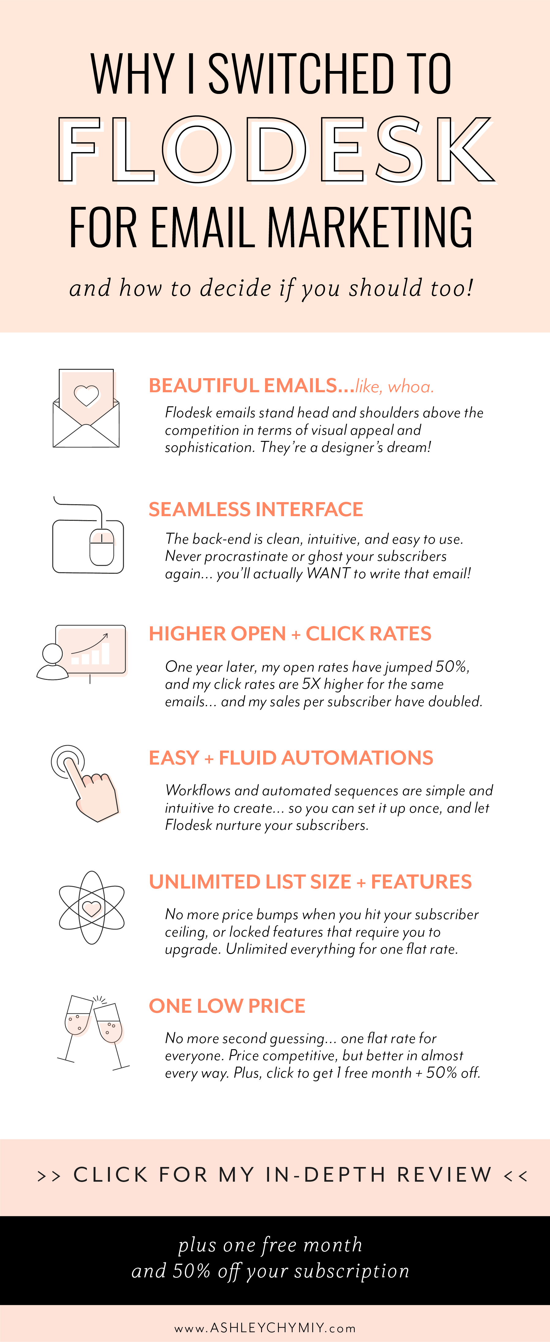
Seriously beautiful emails… like whoa.
Flodesk easily outshines its competitors in terms of aesthetic. The design team is clearly next-level, and has created dozens of built-in templates that make it fast and easy to create beautiful, magazine-worthy emails for your peeps. Here’s a peek at just a few:
There’s a ton of variety in the aesthetic and tone of the templates… but every single one looks like it could come from Apple, and is fully customizable once you get started.
Prefer to build your emails from scratch? Flodesk is your playground. Instantly populate your email with as many sections as you want – text, images, buttons, videos, link menus, dividers, social links, Instagram previews… you get the jist!
…or save time using the many drag-and-drop modules. Some add a cool scrapbook-like vibe to your email, and others look sleek and minimalist. There are tons of these modules (called “layouts” in Flodesk) to choose from, but here’s just a sneak peek at a few:
Choose one that suits your aesthetic, then select your colors, add your text, tweak the font appearance… et voila! Your email instantly looks next-level, like a fancy design firm created it. (Tip: I recommend using no more than two of these in your email, to keep the visual style clean and simple for your readers.)
The built-in fonts deserve a special mention; they’re high-end and beautiful… including the scripts. Have you ever started building a page or email, and struggled to find a script font you actually like? The creators of Flodesk splurged on commercial licensing for high-end, genuinely hand-written fonts you can find on CreativeMarket... A few of my favorite built-in fonts:
These add a genuinely elegant, hand-crafted vibe and distinctly human feel to your emails, making your readers feel like they got a hand-written note from you personally. Use this sparingly on short phrases and sentences to make them stand out!
You can also insert images and animated GIFs, adding life and energy to your emails with one click. Here are a few I created in Procreate for my emails (which you’re welcome to download and use):
One more thing – this is a tiny detail, but I love the crisp look and feel of the buttons. I’m slightly obsessed with clean, pretty buttons that are satisfying to see and click… and Flodesk’s definitely measure up:
Simply put, non-designers will love how easy it is in Flodesk to create sophisticated emails without much effort, using the templates, built-in layouts, and basic tools…
… but designers, rejoice! You’ll also love the level of customization. You have a ton of easy control over the finer details: changing the kerning and spacing, padding around and between sections, adjusting line stroke… these features are all built-in, right at your fingertips. If you care about design flexibility, you’ll love Flodesk.
So when it comes to producing beautiful emails with ease, and surprising and delighting your readers with every email… nothing I’ve seen or tried has even come close to Flodesk.
Fun, intuitive, appealing user interface
I’m a real sucker for a good user interface, and I’m picky about the tools I use in my business. If I have to use a tool that’s clunky, slow, glitchy, or confusing, I’ll procrastinate and just never do it.
So I avoid anything that makes essential tasks feel like a chore. You too? Yay!
Luckily for us, Flodesk’s interface is a dream:
It’s simple, intuitive, and easy on the eyes.
There’s no clutter on the screen to create confusion or distract you from your task.
I’ve yet to find any glitches, clunky features, or functionality that doesn’t work smoothly.
Load times are quick, so changes are fast and easy to make.
Emails are saved automatically as you go, so you won’t lose work if something goes wrong.
It’s easy to toggle from desktop view to mobile view, and see your email on any device.
It’s easy to send instantly (including test emails) or schedule your send in advance.
It’s “the world’s most intuitive email builder” – according to the marketing team. And I agree!
Basically Flodesk is like the Apple of email platforms. Simple, intuitive, beautiful, and functional. That means you’re actually excited to email your list, instead of dreading it because there’s a clunky interface standing between you and your people (trust me, I’ve been there!)
If you’re looking to reduce friction in your workflow, and make your content creation tasks more pleasant, so you’ll actually email your list more often… you can’t go wrong with Flodesk.
Seamless automations and workflows
I had a fair amount of experience with automated email sequences and workflows in other platforms when I tried out Flodesk. Some platforms made automation so confusing and unnecessarily complicated I gave up before I figured it out… others are fine, until I added more complexity, more lists, and more workflows, and then I felt lost in a maze.
Flodesk has been a breath of fresh air in this department. I was able to rebuild all my sequences – better than before – in just a day or two, and now they’re much easier to navigate and update as needed. Even as they get more complex, they’re still visually easy to navigate and understand, so I don’t get lost trying to remember what each step description means.
Not familiar with automations and workflows? This just means you can create a process in advance for each subscriber to go through automatically. You can keep it simple (e.g., Send Emails 1, 2, and 3, with a one-week delay between each) or create complex branching pathways based on subscriber actions (e.g., If a reader clicks a certain link, move them automatically to a different list).
Don’t go crazy with automations early on. Just choose the right tool – later you’ll be glad you have an email platform that makes it easy and intuitive when the time comes!
Higher open rates and click rates
Okay, so I had read about people having higher open rates and click rates on Flodesk… but I was preeettty skeptical. I expected a small bump in the beginning that would taper off over time.
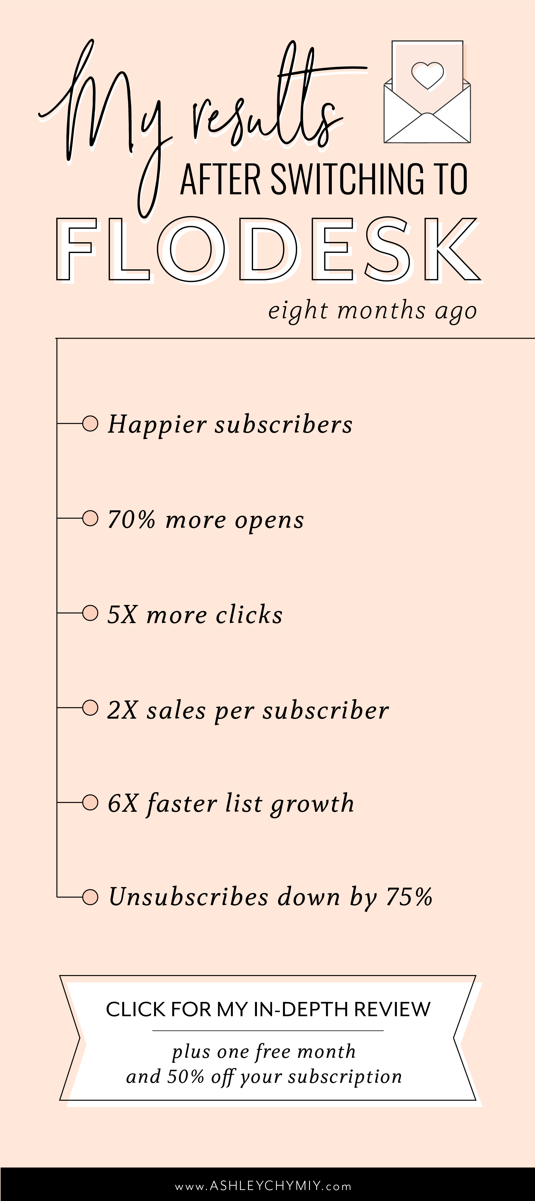
I’m so happy to say I was wrong. Eight months later, my open and click rates are still much higher than they were with MailerLite. The same emails are opened and clicked much more often, and my sales per subscriber have more than doubled as a result.
example:
Welcome sequence
MailerLite: 44% open rate and 38% click rate
Flodesk: 84% open rate, and 61% click rate
Average across all emails*
MailerLite: 32% open rate / 4% click rate
Flodesk: 70% open rate, 19% click rate
*Flodesk doesn’t offer these macro-level metrics, so I had to calculate them myself. More on that below.
My emails were already above the industry average (which is around 17% opens, 2.5% clicks) because I focus on quality over quantity, and I send tons of high-value content to my community for free, that actually helps them make progress.
But switching to Flodesk took my emails to a whole new level. I’m not sure what causes this difference, but I’m guessing it’s a combination of Flodesk doing a better job of avoiding spam filters, and my emails looking and feeling more appealing, and leaving a better impression, so my readers engage with them and look forward to the next ones.
The result: hundreds more people in my community actually connecting with me on Instagram, joining my webinars, checking out my products, setting up discovery calls, and generally deciding to trust me with another step on their journey.
Beautiful sign-up forms & pages
Are you sensing a trend yet? Everything about Flodesk is just lovely... and the sign-up forms and pages are no exception! There are limited options in terms of layout, but once you choose a type (form, page, or pop-up), the formatting is just as versatile as the email interface.
I honestly never liked or used the sign-up forms in other tools… they looked mechanical and clunky, and lacked font options to keep the look consistent with my brand and website. So I always just built my own pages in Squarespace…
...but Flodesk’s are so darn pretty, I actually love using them!
here’s an example:
Unlimited list size + features
Let’s get down to brass tacks! With most email platforms, you start at a low rate (or a free plan) and pay more as your email list grows, and as you need more advanced features. For example:
MailerLite: $0 – $600/year
ConvertKit: $0 – $600/year
ActiveCampaign: $108 – $2748/year
MailChimp: $0 – $3588/year (gasp!)
Etc.
You can avoid this and minimize your costs by cleaning your email list and removing inactive subscribers periodically, but… that’s just not something I want to spend time doing.
Flodesk has one flat rate, no matter how many subscribers you have, or how many features you use. That means it will cost a little more than other platforms in your first year (more on that below!) but the flat rate is well worth it… and personally, gives me peace of mind knowing there’s no bait and switch, my price is locked in, and I’ll never again have to switch platforms and rebuild all those emails down the road again.
It may be hard to imagine you’d hit those bigger list sizes within the first few years… but trust me, you’ll be surprised how quickly it happens when you’re focused on high-quality content.
…and a price I’m actually happy to pay
Flodesk’s flat rate is $418 per year, no matter your list size or how many emails you send.
And currently you can get a free month plus 50% off with my affiliate link, making it $209 per year, or $17 per month – comparable with most other platforms, even if you have only modest growth in the first year.
Personally, I feel much happier paying $200 for a service I love, enjoy, and actually use... versus any amount for a service I’m constantly having to troubleshoot and fight with. If I had stuck with my old provider, I’d be paying $600/year now, and still struggling with the issues I shared above!
That flat rate also gives you access to ALL the features in Flodesk… so you’re not feeling forced to upgrade later because there’s one key premium feature you realized you need or want to try. If you’ve gotten dizzy looking at the pricing options for other providers, and trying to guess which features you’ll want… rest assured, you’re getting unlimited everything with Flodesk.
Investing a tiny amount in your email list now can ultimately give you so much freedom later. As your list grows, it gets easier and easier to create passive income and a wider impact by selling courses, digital products, and other offers on autopilot down the road.
So with the first month free, and a sweet price after that, enjoy trying it out with zero worries.
(Just a reminder: If you use that discount link, I’ll get a small commission at no cost to you! Everyone and their mom is shouting FloDesk from the rooftops right now, and these discount links are everywhere… so thank you for using mine! ♥)
What I wish I knew sooner:
Clear the cache // Flodesk holds onto all your gif, image, and video data throughout each session. This creates a faster load time – but if your emails are visually complex like mine, all that data piles up after a while. If you sense a slow down, you’ll need to log out and clear your browser cache to get things moving quickly again. Not a big deal, and I don’t have to do it often, but it’s just something to be mindful of.
Analytics are in progress // Flodesk recently added more robust analytics functionality, but other platforms still give you more data… but to be honest, just knowing my open rates, click rates, and sales are a lot higher is enough for me. If you’re someone who needs all the nitty gritty details and numbers, you may want to bite the bullet and invest in a pricier product like ConvertKit or ActiveCampaign.
Some integrations are not available yet // Like I said, Flodesk is still fairly new, so the list of integrations is substantial, but not unlimited. I’m guessing more options will be added to Flodesk (or Zapier) at some point down the road, but if you feel the need for really robust and complex scalable integrations and automations and funnels right now, just be aware of the limitations.
You can create templates // I built probably 10 emails from scratch before I realized you can actually add any email to “favorites” and then use it as a starting point for any future emails. This feature wasn’t immediately obvious to me for some reason – so just know you can create one email as a template, click the heart to save it to Favorites, and never start from scratch again!
Sign-up pages are simple // Many email providers will include complex sign-up page templates that almost look like a whole website. Flodesk doesn’t offer this; the standalone sign-up pages are beautiful, but they’re simple and to the point. If you need your email platform to double as your website, Flodesk may not be the right choice.
The best customer support option is on Facebook // I avoid Facebook as much as possible… but the Flodesk Insiders group is actually awesome. When I have a question, I can usually search the group and find my question and the answer from the technical team… and if not, I can post my question and usually get a swift response within a few minutes (Petra, you’re the real MVP!). If it sounds clunky, it’s not. It’s amazing.
So, who is Flodesk for?
Flodesk is right for you if…
You want to create beautiful, immersive emails & experiences for your readers.
You’re building a premium brand and want every touchpoint to feel luxurious.
You want each and every subscriber to genuinely look forward to your emails.
You favor a “quality over quantity” approach in your content.
You want the process and interface to be easy, intuitive, simple, and pleasant.
You want higher open rates and click rates, but don’t need complex analytics.
You want to encourage yourself to actually send emails, by making the process pleasant.
Flodesk may not be right for you if…
You’re playing a numbers game, and detailed metrics are essential to you.
You need in-depth analytics, A/B testing, and complex automation capabilities.
You have very specific needs for integrations with other sales funnel tools and platforms.
You’d rather start with a free service and pay more later, than pay $200/year upfront.
You don’t care about design or aesthetic; you just want to send simple text-based emails.
You need your email provider to also host full complex web pages.
I hope this review was useful and helped you decide whether Flodesk is worth trying out! I genuinely love it, and so do my readers… and am so excited for you to give it a whirl :)
get started:
Get your first month free and 50% off with this link:
At the end of your free trial month, the 50% off discount will be applied to your first payment.
Happy creating!


